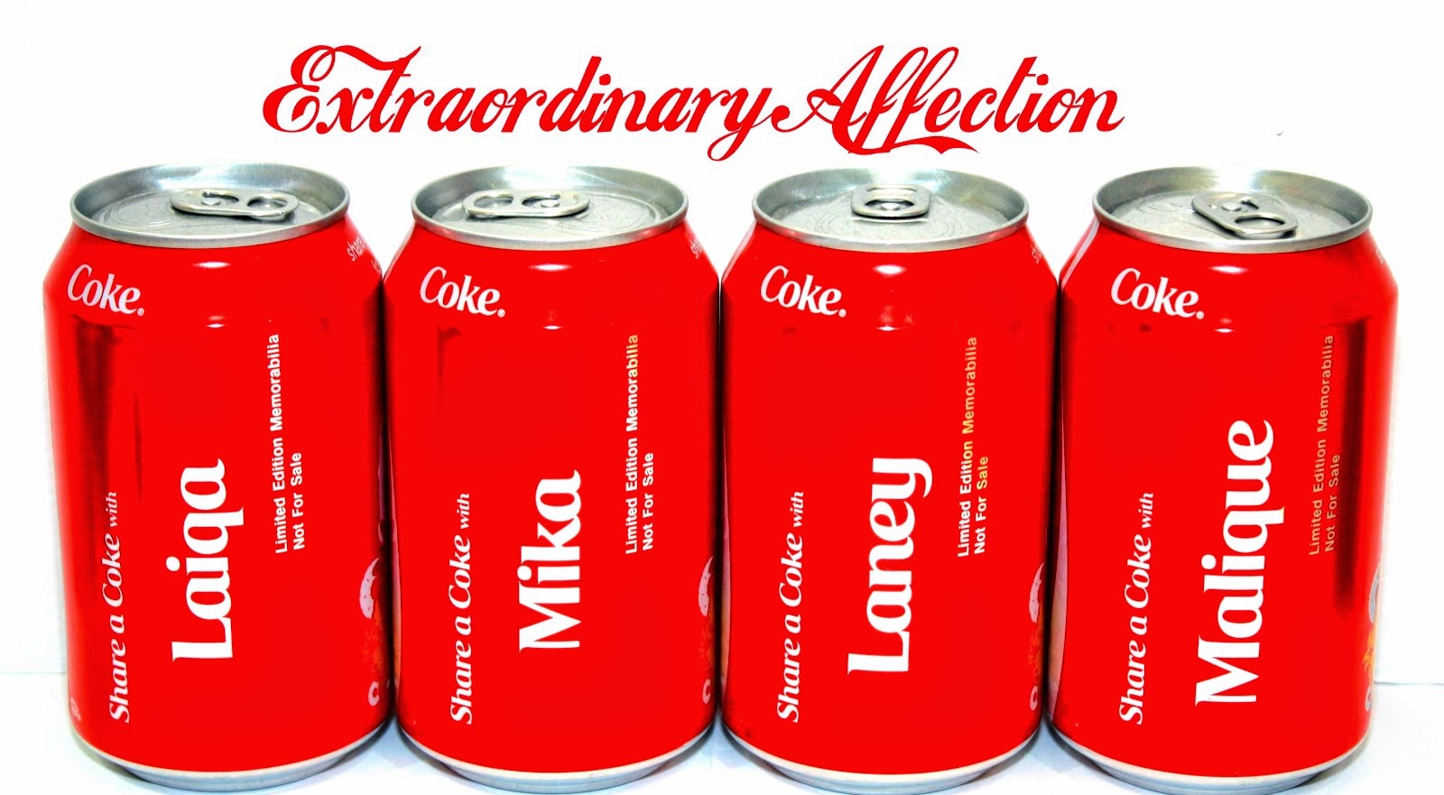
Bored with the same background, i've finally find the time to revamp this blog. I'm sticking to white and red as this is our wedding theme and i totally dig this 2 colors combination!
This layout and design is best view in chrome, although i don't see any different in IE except for the missing semi transparent background for the sidebars. I haven't test this via Safari or Firefox, hope there won't be much different there as well~
I hope you guys like it!!

2 comments:
it is also best viewed in firefox, i guess (i'm on it)
wah sume dah revamp nih! hahaha!
hahaha bagus2.. thanks for the feedback biqque! aku busan tgk blog sama jek and korg pun asyik dok tukar2 jek
Post a Comment